
 By
ByTypography is not just decoration. It is the first thing your audience feels before they read a single word. In 2026, as design trends shift away from the overused clean-sans-serif era, editorial fonts are back at the center of every premium branding and social media project.
If you have spent hours hunting for the right display serif that looks like it belongs on the cover of Vogue or Architectural Digest — without spending money — this list is for you.
In this article, I am sharing 5 of the best free editorial fonts for designers in 2026, all free for personal use, all with that signature high-contrast magazine-style personality.
What Are Editorial Fonts?
Editorial fonts are display typefaces designed primarily for headlines, magazine covers, poster titles, and brand identities where making a strong visual impact matters more than long-form readability. They typically feature high stroke contrast — thin hairlines paired with thick stems — decorative swashes, ligatures, and elegant proportions borrowed from classical print typography.
The term “editorial” comes directly from the magazine and publishing industry, where art directors have long used these dramatic typefaces to set the tone of an entire issue with just a single word on the cover.
In the digital era, editorial fonts have migrated from print to Instagram carousels, YouTube thumbnails, brand presentations, and website hero sections. They are the fastest way to add luxury, authority, and visual personality to any design.
Why Editorial Typography Is Trending in 2026
The design world moves in cycles. After years of brands defaulting to neutral sans-serifs like Inter, Poppins, and DM Sans, 2026 is seeing a strong resurgence of editorial and display serif typography. Here is why:
Clients increasingly want their brand to feel premium and distinct, but creative budgets have not grown at the same pace. A well-chosen editorial font does the heavy lifting that an expensive photoshoot used to do — it communicates authority, elegance, and intentionality instantly.
Social media platforms, particularly Instagram and LinkedIn, have become visual-first environments where the first 0.5 seconds of impression decide whether someone stops scrolling. Bold, high-contrast display serif fonts stop the scroll far more effectively than body-weight sans serifs.
Additionally, the rise of AI-generated imagery means that photography and illustration are no longer differentiators. Typography has become the primary human design decision — the one element that still requires a trained eye and genuine aesthetic judgment. Designers who master editorial typography in 2026 will stand apart from those relying on AI defaults.
Honera — The Fashion-Forward Serif
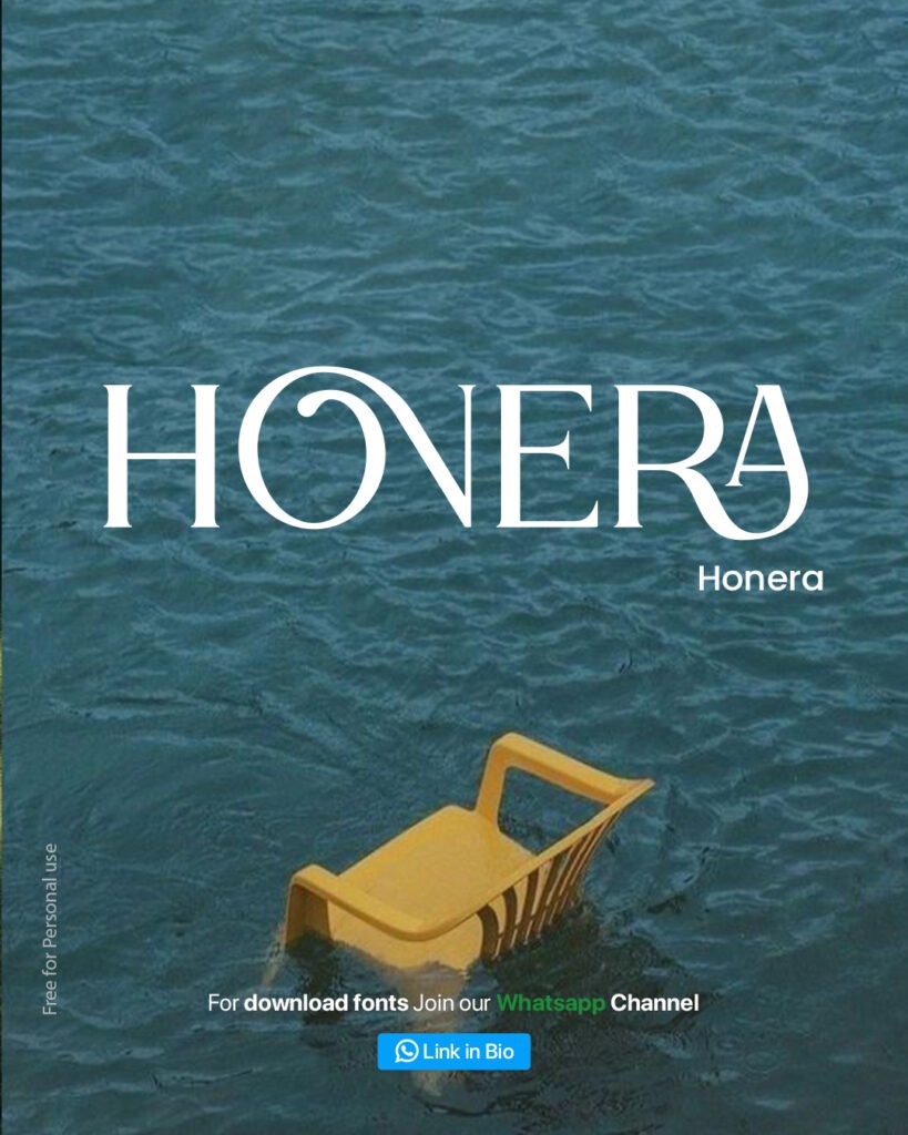
Honera is an all-caps display serif with wide letterforms and strong horizontal crossbars. The design draws heavily from fashion magazine mastheads — the kind of typography you would expect on the cover of a luxury lifestyle publication.
What makes Honera work is its optical balance. The letters sit wide, which means they fill a headline space confidently without needing to be pushed to extreme sizes. The O in particular is a signature design detail — slightly condensed and elegant in a way that gives the full word an airy, editorial quality.
Best uses for Honera include luxury brand identities, fashion editorial covers, Instagram carousel title slides, high-end event posters, and hero section headlines on premium websites.
It is free for personal use, making it an excellent choice for portfolio projects, concept presentations, and client mockups before committing to a licensed typeface.
Byena — The Organic Editorial Weight
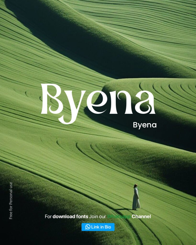
Byena brings something that most editorial fonts sacrifice for drama — warmth. It is a high-contrast serif with a distinctly organic character, meaning the letterforms carry subtle humanist irregularities that make them feel hand-crafted rather than mechanically constructed.
The B in Byena is a standout character — the bowls are slightly uneven in a deliberate, designed way that gives the entire font a lived-in quality. This makes Byena ideal for brands that want premium editorial status but also need to feel approachable and authentic.
This is the font for sustainable fashion brands, artisan food labels, boutique wellness studios, travel editorial layouts, and indie magazine covers. It works beautifully in both all-caps display settings and mixed-case headline configurations.
If you are working on a brand identity that needs to feel both sophisticated and human, Byena deserves a place at the top of your type library.
Arniya — The Swash Script Hybrid
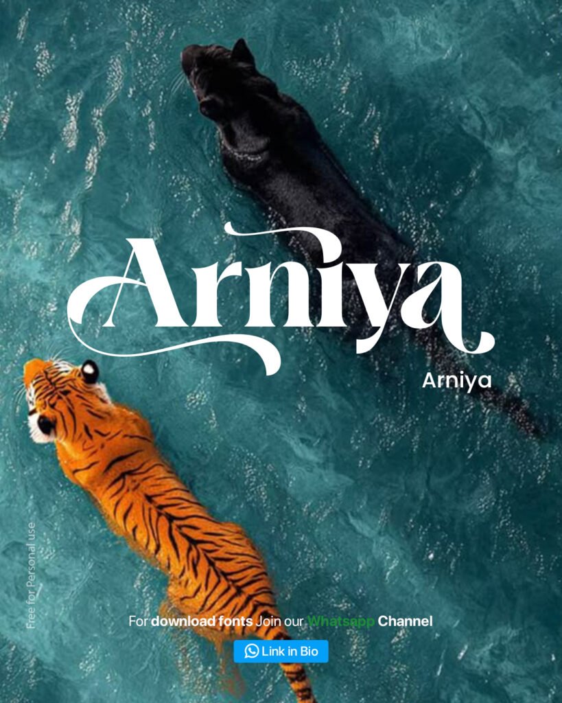
Arniya is the most expressive font in this collection. It blends high-contrast serif letterforms with generous swash extensions and calligraphic entry strokes that give it the personality of a script font while maintaining the readability of a serif.
The capital A is particularly striking — a tall, sweeping form with a dramatic curve that anchors the entire word. The lowercase letters follow with warm, flowing strokes that create natural connections between characters even though this is not a true script font.
Arniya is perfect for luxury wedding invitations, beauty brand logos, high-end restaurant identity systems, boutique hotel signage, and lifestyle brand editorial headers. It photographs exceptionally well, which is why it works so effectively as a font for Instagram carousel title slides where the typography itself is the visual hero.
One important usage note — because of its expressiveness, Arniya works best at large display sizes. Avoid using it below 36pt, as the swash details lose their impact at smaller scales.
Cronde — The Geometric Display Serif
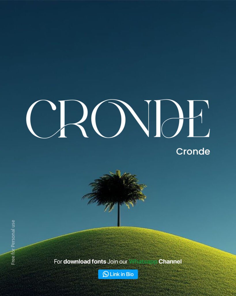
Cronde takes the editorial serif formula in a more architectural direction. Where Honera is fashion and Byena is organic, Cronde is structural — a high-contrast display serif with geometric proportions and sharp, confident terminals.
The most distinctive feature is the letterform logic. Each character feels like it was drawn with a compass and a set square before being refined with calligraphic contrast. The result is a typeface that carries the authority of a legal masthead or a heritage brand identity while still feeling completely contemporary.
Cronde excels in tech brand editorials, architecture and interior design publications, premium corporate identities, book cover design, and any project where strength and elegance need to coexist. It pairs beautifully with minimal sans-serifs for body text — the contrast between Cronde’s drama and a neutral body font creates exactly the visual hierarchy that magazine layouts are built on.
Capline — The Cinematic Bold
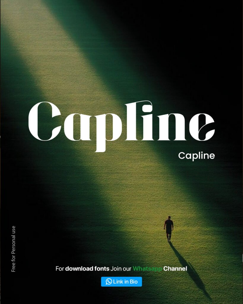
Capline is the heavyweight of this collection, and deliberately so. This is a bold display serif with thick strokes, dramatic thin-thick contrast, and a presence that commands attention across any format — whether printed at two inches or displayed at two hundred pixels.
The design takes clear inspiration from the golden age of cinema typography. Think film title cards from the 1960s and 1970s, updated with contemporary proportions and spacing. Capline has that quality of feeling both nostalgic and entirely modern at the same time.
This font is made for YouTube thumbnail design, social media cover images, movie-style poster design, music release artwork, and editorial magazine spreads where you need the headline to do all the visual work. It also performs excellently in dark background contexts — the thick strokes read with exceptional clarity on deep navy, forest green, or black backgrounds, as demonstrated in the carousel image itself.
How to Use These Fonts in Your Projects
Getting the most out of editorial fonts requires attention to a few principles that separate professional typographic design from amateur attempts.
Size matters more than you think. All five fonts in this collection are display typefaces, meaning they are designed to be used large. As a general rule, use them at 60pt minimum for print and 80px minimum for digital. At smaller sizes, the fine hairline details that give these fonts their elegance become muddy and the premium quality is lost.
Tracking and spacing should be adjusted for all-caps settings. When using Honera or Cronde in full uppercase, add 50–100 units of letter-spacing to allow the characters room to breathe. Tight tracking in all-caps display settings is one of the most common typographic mistakes junior designers make.
Color contrast is your friend. These fonts perform best with maximum contrast — white on dark photography, deep black on light backgrounds, or a single bold accent color. Avoid mid-tone colors for large editorial headlines as they lose legibility against complex background imagery.
Limit yourself to one editorial font per composition. These typefaces are designed to be the hero of your layout. Using two expressive display fonts in the same design creates visual competition that undermines the impact of both.
Font Pairing Tips for Magazine Style Layouts
The best magazine layouts have always been built on the tension between a dramatic display serif and a clean, neutral body font. Here are the pairings that work best with each font in this collection.
Honera pairs well with Inter or Helvetica Neue for body text. The wide, stately proportions of Honera need a body font with no competing personality.
Byena works beautifully alongside Lora or Crimson Text for longer body copy when you want to maintain a warm, humanist editorial feel throughout the entire layout.
Arniya is best paired with a geometric sans like Futura or DM Sans. The contrast between Arniya’s calligraphic expressiveness and a structured sans creates the kind of visual tension that high-end brand identities are built on.
Cronde pairs naturally with Neue Haas Grotesk or IBM Plex Sans. Both carry a structural, purposeful quality that complements Cronde’s architectural character.
Capline demands the simplest body font possible — pure Inter, Roboto, or even system UI fonts. Let Capline do all the expressive work and let the body text disappear into clean legibility.
What is an editorial font?
An editorial font is a high-contrast display typeface designed for use in headlines, magazine covers, and brand identity work. These fonts are characterized by dramatic variation between thick and thin strokes, decorative details like swashes and ligatures, and proportions that make them visually impactful at large display sizes.
Are these fonts free for commercial use?
All five fonts featured in this article — Honera, Byena, Arniya, Cronde, and Capline — are free for personal use. For commercial projects, always check the individual font license on the original download page before use in client work or published materials.
What font is used in magazine titles?
Most luxury magazines use custom or licensed high-contrast serif typefaces. Fonts that closely replicate this aesthetic for free or low cost include Cormorant Garamond, Playfair Display, and the five fonts covered in this article. Honera and Cronde in particular most closely match the visual language of fashion and lifestyle magazine mastheads.
Can I use editorial fonts on Instagram?
Yes. Editorial fonts work extremely well for Instagram carousel title slides, Reels thumbnails, story graphics, and brand post templates. Honera, Capline, and Cronde are particularly effective for social media use because of their bold, legible forms at the sizes and resolutions social platforms require.
Where can I download these fonts?
Join the tutorialsbynitin WhatsApp channel for direct download links to all fonts shared in our design resources. Link is available in the Instagram bio at @nitinmonga14.
Subscribe for Newsletter

