
 By
ByIntroduction: Elevate Your Design with Fresh Typography
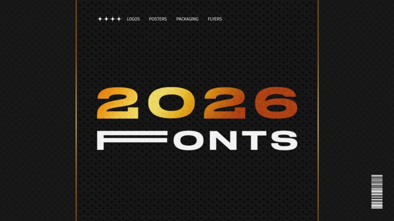
Free Fonts Download 2026: 6 Premium Typography Fonts | Typography plays a crucial role in modern graphic design, and finding high-quality free fonts can transform your creative projects. Whether you’re working on logos, posters, packaging designs, or promotional flyers, the right typeface communicates your message effectively while adding visual appeal to your work.
In this comprehensive guide, we’re showcasing six exceptional free fonts from our 2026 collection that every designer should have in their toolkit. Each font in this curated selection offers unique characteristics suitable for different design applications, from bold display typography to elegant decorative styles.
Why Quality Typography Matters in Design
Before diving into our font collection, let’s understand why typography is fundamental to successful design projects. Professional typography can make the difference between amateur-looking designs and polished, professional work that captures attention and communicates effectively.
Typography influences readability, brand perception, emotional response, and overall aesthetic appeal. When you download free fonts that align with your project requirements, you gain access to professional-level design resources without breaking your budget.
The 2026 Free Font Collection Overview
Our carefully selected collection features six diverse typefaces, each designed for specific applications in graphic design. These fonts are available for personal use and can be downloaded through our WhatsApp channel, making premium typography accessible to designers, students, and creative enthusiasts.
Let’s explore each font in detail, examining their characteristics, ideal use cases, and what makes them stand out in the crowded world of free typography. Free Fonts Download 2026
1. Stretch Pro: Modern Extended Display Font
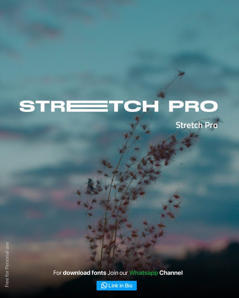
Stretch Pro is a contemporary display font characterized by its horizontally extended letterforms and clean, geometric construction. This modern typeface features horizontal lines integrated into the letters, creating a distinctive visual rhythm that commands attention.
Design Characteristics
The Stretch Pro font family showcases bold, wide characters with consistent stroke weights and geometric precision. The horizontal emphasis creates a sense of stability and forward momentum, making it ideal for headlines and display applications where impact matters.
Best Applications for Stretch Pro
This extended display font excels in modern branding projects, tech company logos, website headers, product packaging, and contemporary poster designs. Use Stretch Pro when you need typography that feels current, professional, and confidence-inspiring.
Design Tips for Using Stretch Pro
When working with Stretch Pro, consider generous letter spacing to enhance readability. This font works beautifully against photographic backgrounds, particularly nature scenes with soft focus elements. Pair it with simple sans-serif body fonts for optimal hierarchy in multi-font layouts. Free Fonts Download 2026
2. Sundown: Bold Condensed Typography
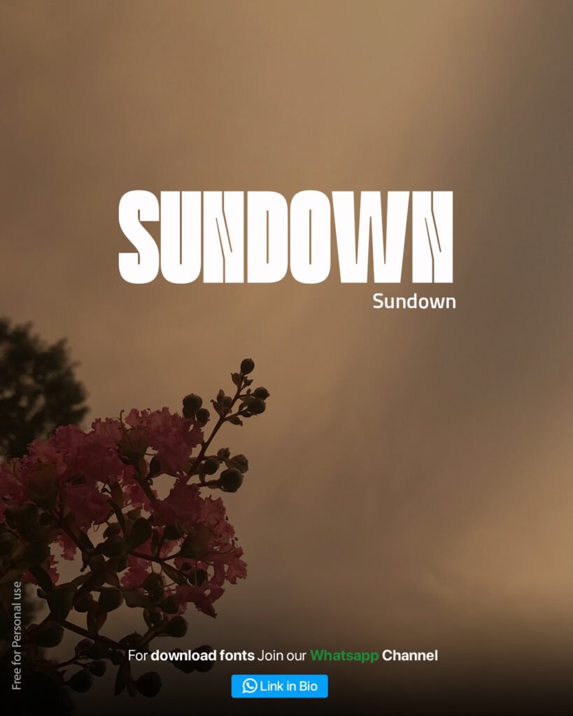
Sundown brings powerful, condensed letterforms to your design toolkit. This ultra-bold display font features tight letter spacing and strong vertical emphasis, creating dramatic headlines that demand attention.
Typography Features
The Sundown font showcases extremely heavy stroke weights with condensed proportions. Each character fills vertical space efficiently while maintaining legibility, making it perfect for designs where space is limited but impact is essential.
Ideal Use Cases
Sundown works exceptionally well for music posters, event flyers, magazine covers, sports branding, and any project requiring bold, masculine typography. The condensed nature allows more text in limited horizontal space while maintaining visual impact.
Combining Sundown with Other Elements
This bold font pairs beautifully with warm, sunset-inspired color palettes and nature photography. Consider using Sundown for primary headlines while employing lighter-weight fonts for supporting text to create effective typographic hierarchy.
3. April: Elegant Thin Display Font

April represents refined elegance with its ultra-thin strokes and tall, elongated letterforms. This sophisticated display font brings a sense of delicacy and contemporary minimalism to design projects.
Font Characteristics
Featuring extremely thin stroke weights and extended vertical proportions, April creates an airy, sophisticated aesthetic. The tall, narrow characters evoke spring freshness and modern refinement, perfect for elegant branding applications.
Perfect Projects for April Font
Use April for luxury brand identity, wedding invitations, fashion editorial design, beauty product packaging, lifestyle blogs, and any project requiring sophisticated, feminine typography. This font communicates refinement and contemporary elegance.
Design Considerations
Due to its thin strokes, April works best at larger sizes where delicate details remain visible. Pair with plenty of white space and complementary serif or script fonts for secondary text. This font shines against soft, blurred backgrounds with natural elements. Free Fonts Download 2026
4. Laren: Decorative Display Font with Flourishes
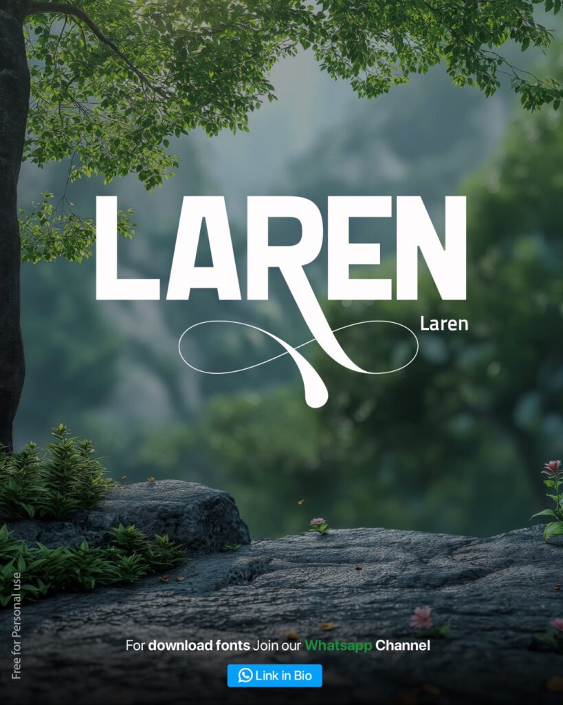
Laren combines bold display typography with elegant decorative flourishes, creating a unique typeface that balances strength with sophistication. The integrated infinity symbol flourish adds distinctive character.
Distinctive Design Elements
Laren features bold, wide letterforms enhanced by elegant swash elements. The distinctive tail extending from the letter “N” creates a flowing infinity symbol, adding decorative interest while maintaining readability in display applications. Free Fonts Download 2026
Recommended Applications
This decorative font excels in premium brand logos, wedding design, restaurant branding, wine labels, boutique signage, and any project requiring typography with personality and elegance. Laren works particularly well for businesses targeting sophisticated audiences.
Styling Laren Effectively
The decorative flourishes in Laren require careful placement to avoid visual clutter. Use this font for primary brand names or short headlines rather than body text. Pair with clean, simple supporting typefaces to let Laren’s distinctive character shine.
5. BigBold: Heavy Weight Display Typography
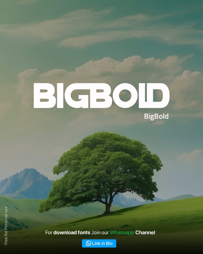
BigBold delivers exactly what its name promises—extremely heavy, bold letterforms designed for maximum impact. This ultra-bold display font creates powerful headlines that can’t be ignored.
Font Design Features
With exceptionally thick stroke weights and robust character construction, BigBold dominates any composition it occupies. The font maintains readability despite its extreme weight, making it versatile for various bold typography applications. Free Fonts Download 2026
Where BigBold Shines
Use BigBold for sports branding, fitness marketing, construction companies, automotive advertising, product launches, and any context requiring powerful, confident typography. This font communicates strength, reliability, and boldness.
Working with BigBold
Due to its heavy weight, BigBold requires adequate surrounding white space to prevent visual overwhelm. This font works exceptionally well with nature photography and cloudy sky backgrounds. Consider using transparency or outline treatments for creative variations.
6. Myrahe: Contemporary Geometric Display Font
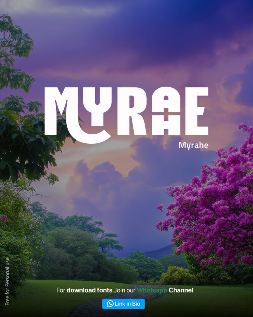
Myrahe rounds out our collection with contemporary geometric styling and unique letter construction. This modern display font features distinctive cutout details that create visual interest while maintaining bold presence.
Design Attributes
Myrahe showcases bold letterforms with geometric precision and creative negative space treatment. The distinctive plus sign cutouts in certain letters add contemporary flair while the overall weight ensures strong visual presence. Free Fonts Download 2026
Optimal Use Cases
This font works beautifully for modern brand identity, tech startups, creative agency branding, music album covers, contemporary poster design, and digital product interfaces. Myrahe communicates innovation and creative thinking.
Design Best Practices
The geometric nature of Myrahe makes it particularly effective when aligned with grid-based layouts. Pair with vibrant color gradients or dramatic nature photography for striking visual combinations. Use adequate sizing to ensure the distinctive cutout details remain visible and effective.
How to Download Free Fonts from Tutorials By Nitin
Accessing our 2026 free font collection is straightforward through our WhatsApp channel distribution system. This delivery method ensures you receive high-quality font files directly while staying updated on new typography releases. Free Fonts Download 2026
Step-by-Step Download Process
- Join our WhatsApp Channel through the link provided in our social media bio
- Comment “2026” on our Instagram or Facebook posts to receive the download link
- Access the font files through the provided link
- Download and install fonts according to your operating system requirements
- Start creating with your new typography resources
Installation Instructions
After downloading Free Fonts Download 2026, installation varies by operating system. Windows users can right-click font files and select “Install,” while Mac users can double-click to open Font Book and add new typefaces. Ensure you close design applications before installing fonts to guarantee they appear in your software font menus.
Typography Trends in 2026
Understanding current typography trends helps designers create relevant, contemporary work. The 2026 design landscape continues emphasizing bold display fonts, geometric precision, extended and condensed letterforms, and typefaces that make strong statements.
Bold Display Typography
Large, impactful headlines remain dominant in 2026 design trends. Our collection reflects this with multiple bold options like BigBold, Sundown, and Myrahe, each offering different approaches to commanding attention through typography.
Geometric Precision
Clean, geometric construction continues trending, visible in fonts like Myrahe and Stretch Pro. This approach communicates modernity, professionalism, and technical sophistication—qualities valued across industries.
Extended and Condensed Forms
Playing with letter proportions creates visual interest and solves practical design challenges. Stretch Pro’s extended forms and Sundown’s condensed characters demonstrate this trend’s versatility for different spatial requirements.
Pairing Fonts Effectively
Creating effective typography combinations involves understanding visual hierarchy, contrast, and complementary characteristics. While our featured fonts work beautifully as headline typefaces, pairing them with appropriate body fonts creates polished, professional designs.
Hierarchy Principles
Establish clear visual hierarchy by using display fonts for headlines and simpler, more readable typefaces for body text. This contrast helps guide viewers through your content while maintaining aesthetic cohesion.
Complementary Characteristics
Pair geometric display Free Fonts Download 2026 with humanist sans-serifs, or bold headlines with light-weight body text. Contrast creates interest while similarity creates harmony—balance both for effective typography combinations.
Free Fonts Download 2026 vs. Premium Typography
While premium font libraries offer extensive options, high-quality free fonts provide excellent resources for personal projects, learning designers, and budget-conscious creators. Our collection demonstrates that free doesn’t mean compromising on quality or design sophistication.
When Free Fonts Work Best
Personal projects, student work, portfolio pieces, social media graphics, and experimental design benefit tremendously from free font resources. These applications allow designers to explore typography without financial barriers.
Understanding Licensing
Always review font licenses before use. Our 2026 collection is designated for personal use, meaning non-commercial projects, personal branding, learning exercises, and portfolio development. Commercial projects may require purchasing licenses or using explicitly commercial-free fonts.
Typography in Different Design Applications
Each design medium presents unique typographic considerations. Understanding how fonts perform across various applications ensures successful project outcomes.
Logo Design Typography
Logo typography requires distinctive character, scalability, and timeless appeal. Laren, with its decorative flourishes, and Stretch Pro, with its modern geometric styling, both offer strong options for memorable brand marks that reproduce well across sizes.
Poster Design Free Fonts Download 2026
Posters demand immediate visual impact and readability from distance. BigBold, Sundown, and Myrahe excel in poster applications, creating powerful headlines that capture attention in crowded visual environments.
Packaging Typography
Product packaging typography must balance aesthetic appeal with practical readability. Consider how fonts reproduce in various printing methods and materials. Bold options like BigBold and Sundown maintain clarity even in challenging printing conditions.
Flyer Design Fonts
Flyer design requires clear hierarchy, quick readability, and visual appeal that attracts attention in hand-to-hand distribution scenarios. All fonts in our collection work effectively for flyer headlines when paired with appropriate body text.
Technical Considerations for Font Usage
Beyond aesthetic choices, technical aspects impact how fonts perform in real-world applications. Understanding these factors ensures professional results.
Font Formats and Compatibility
Modern fonts typically come in TrueType (.ttf) or OpenType (.otf) formats. OpenType offers more advanced features but both work across platforms. Ensure downloaded fonts are compatible with your design software before beginning projects.
Web Font Usage
Using display fonts online requires different considerations than print design. File size, loading speed, and fallback fonts matter for web performance. Consider web-optimized versions or system font fallbacks for body text while using display fonts sparingly for impact.
Print Reproduction
Bold display fonts generally reproduce well in print, but extremely thin fonts like April may require testing to ensure visibility, especially in smaller sizes or on textured papers. Always proof print-critical projects before final production.
Building Your Font Library Strategically
Curating an effective font collection involves strategic selection rather than hoarding hundreds of typefaces. Focus on versatile fonts covering different styles and applications.
Essential Font Categories
A well-rounded library includes bold display fonts (like our entire 2026 collection), clean sans-serifs for body text, classic serifs for traditional projects, script fonts for decorative purposes, and monospace fonts for technical applications.
Organization Best Practices
Organize downloaded fonts into folders by category, style, or project type. This organization saves time during design work and helps you locate appropriate typography quickly when creativity strikes.
Learning Typography Fundamentals
Great design requires more than font collections—understanding typography principles elevates your work from adequate to exceptional.
Kerning and Letter Spacing
Kerning adjusts space between specific letter pairs while tracking adjusts overall letter spacing. Display fonts often benefit from customized kerning to achieve optical balance, particularly at large sizes.
Leading and Line Height
Vertical spacing between lines affects readability and visual texture. Display typography typically uses tighter leading than body text since headlines usually occupy few lines where readability challenges differ from paragraph text.
Alignment and Composition
Typography alignment—left, right, center, or justified—creates different visual effects and impacts readability. Display fonts often work well centered for maximum impact, while body text typically benefits from left alignment for optimal readability.
Conclusion: Expanding Your Creative Possibilities
Typography remains one of design’s most powerful tools for communication and visual impact. Our 2026 free font collection provides six distinctive typefaces—Stretch Pro, Sundown, April, Laren, BigBold, and Myrahe—each offering unique characteristics for different creative applications.
Whether you’re designing logos, posters, packaging, or flyers, this collection provides professional-quality typography resources for personal projects. By understanding each font’s strengths and applying typography principles effectively, you’ll create designs that communicate clearly while capturing attention.
Download these free fonts today through our WhatsApp channel and expand your creative toolkit with professional typography that elevates your design work. Remember to respect licensing terms, experiment with different combinations, and continue developing your typography skills through practice and exploration.
Visit www.tutorialsbynitin.com to access our complete font library and discover additional design resources, tutorials, and creative tools that support your journey as a designer.
Source: Befonts, DafontFree
Subscribe for Newsletter

