Best Resume Fonts for your CV in 2024 free with download links.📣
Choosing the right font for your resume is crucial for passing through Applicant Tracking Systems (ATS) and landing in the hands of a human recruiter.
While you might be tempted to use fancy fonts to make your resume stand out, ATS systems struggle to read them. Opt for classic, easy-to-read fonts like Times New Roman, Arial, Calibri, or Georgia. These fonts are universally recognized by ATS software and ensure your resume content is accurately scanned.
Remember, the goal is to get past the ATS, not impress it with design elements. Prioritize readability and ATS compatibility for the best chances of resume success.
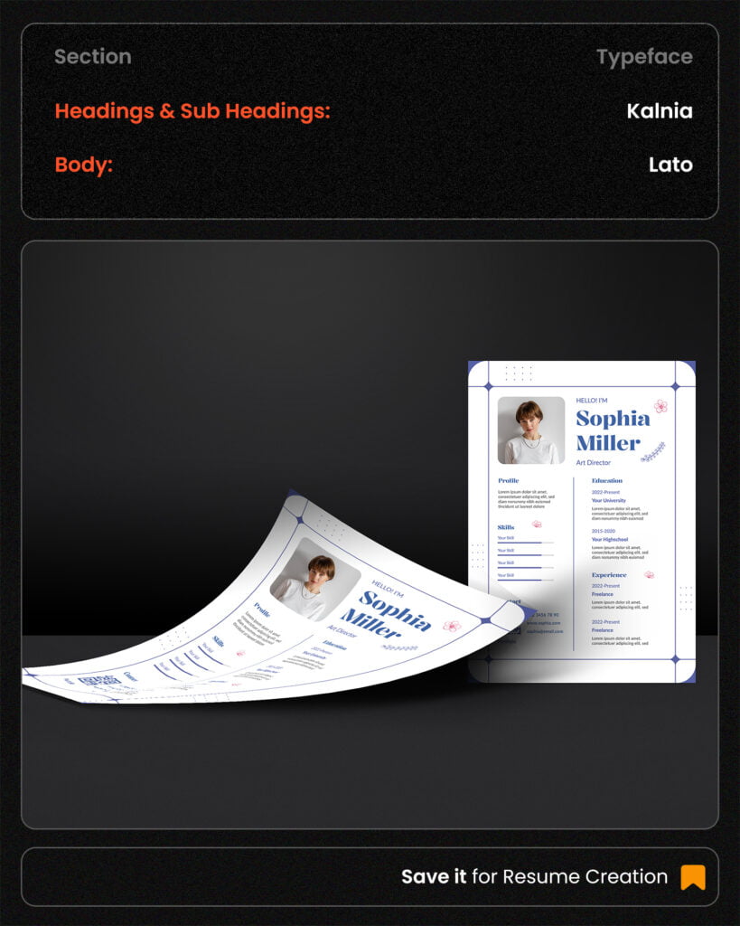
Kalnia Font & Lato Font
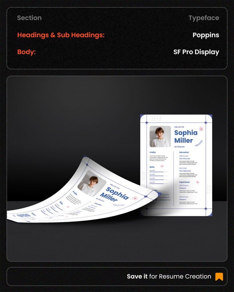
Poppins Font & SF Pro Display Font
Magic Sans Font & Arial Font

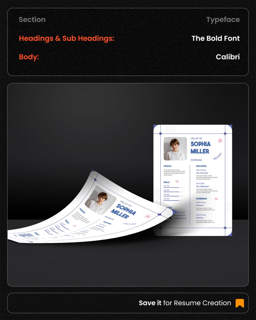
The Bold Font & Calibri Font
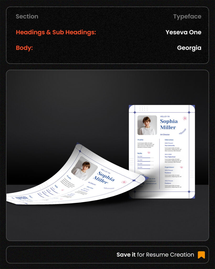
Yeseva One Font & Georgia Font
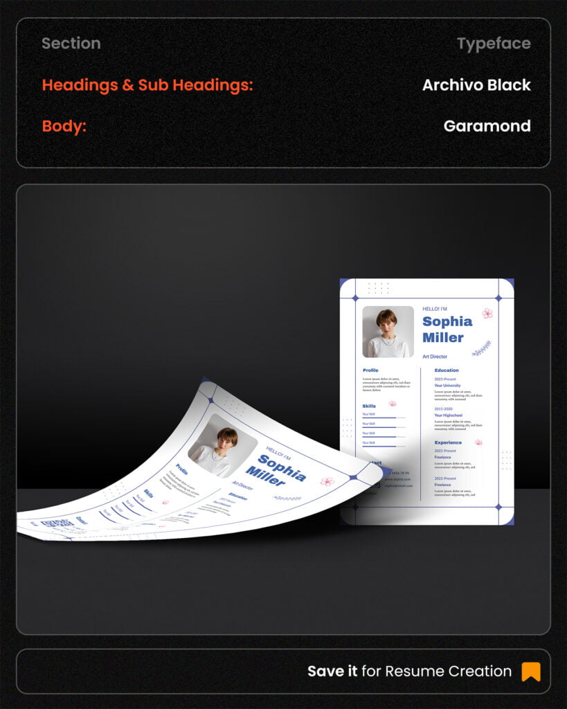
Archivo Black Font & Garamond Font
The Importance of Fonts in ATS-Friendly Resumes
In the digital age of recruitment, where Applicant Tracking Systems (ATS) are the gatekeepers to most job opportunities, the design of your resume takes on a new level of importance. While creativity and visual appeal are essential for human readers, the ATS is a cold, logical machine that prioritizes efficiency and data.
Understanding ATS
An ATS is a software application used by recruiters to manage the recruitment process. It sorts through hundreds, sometimes thousands, of resumes to identify candidates who meet specific job requirements. To do this, it scans resumes for keywords and matches them against job descriptions. This is where the role of fonts becomes critical.
Tips for Choosing the Right Font
Prioritize Readability: Opt for fonts that are clear and easy on the eyes.
Consistency is Key: Use the same font throughout your resume for a professional look.
Font Size: Maintain a standard font size of 10-12 points for body text and slightly larger for headings.
Font Color: Stick to black for your font color. Avoid using colors as they can interfere with ATS scanning.
Test Your Resume: Before submitting your resume, run it through an ATS simulator to check for any compatibility issues.
The Role of Fonts in ATS Compatibility
ATS-Friendly Fonts: These are classic, simple fonts that are widely supported by ATS software. They are clean, easy to read, and ensure your content is accurately scanned.
Serif Fonts: Times New Roman, Georgia, Garamond
Sans-Serif Fonts: Arial, Helvetica, Calibri, Tahoma, Verdana
Fonts to Avoid: Decorative, script, or overly stylized fonts can confuse the ATS and hinder your chances of getting past the initial screening.
Additional Font Considerations
While the focus is on ATS compatibility, the font you choose can also influence the overall impression of your resume.
- Industry and Job Role: Consider the industry and the specific job you’re applying for. A traditional industry might prefer a classic serif font like Times New Roman, while a creative field might allow for a slightly more modern sans-serif option like Arial or Helvetica.
- Resume Length: For longer resumes, a sans-serif font like Arial can help improve readability due to its open spacing.
- Balance: While it’s essential to prioritize ATS compatibility, don’t sacrifice the overall look and feel of your resume. Choose a font that strikes a balance between professionalism and readability.
By carefully selecting an ATS-friendly font and following these guidelines, you can significantly increase your chances of passing through the ATS and getting your resume noticed by a human recruiter.
More Fonts for Resume ATS Compatibility
To maximize your chances of passing through the ATS, stick to classic, easily readable fonts. Here are some of the most recommended options:
- Times New Roman: A traditional serif font, widely recognized and compatible with most ATS systems.
- Arial: A clean, sans-serif font, offering good readability and compatibility.
- Calibri: A modern sans-serif font, often the default in Microsoft Word, ensuring wide compatibility.
- Georgia: A serif font with a modern feel, providing a balance between readability and aesthetics.
- Verdana: A sans-serif font designed for on-screen readability, making it a good choice for digital resumes.
- Helvetica: A classic sans-serif font, known for its clean lines and versatility.
Join WhatsApp Channel for Download links
Subscribe for Newsletter

