Auto Fix Colors in Photoshop
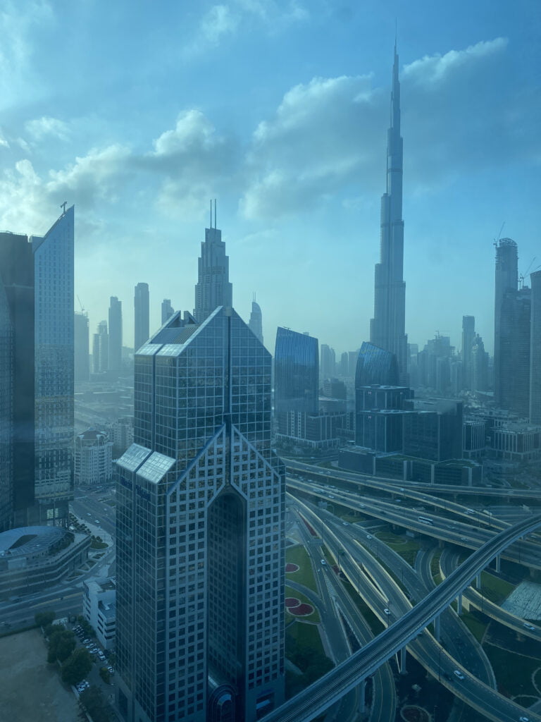
Here’s a picture I took through a tinted window in Dubai because I didn’t have the dhams to go to the Terrace and here’s how to fix all the Blues in here click on the adjustment Layer icon and then choose our favorite curves now
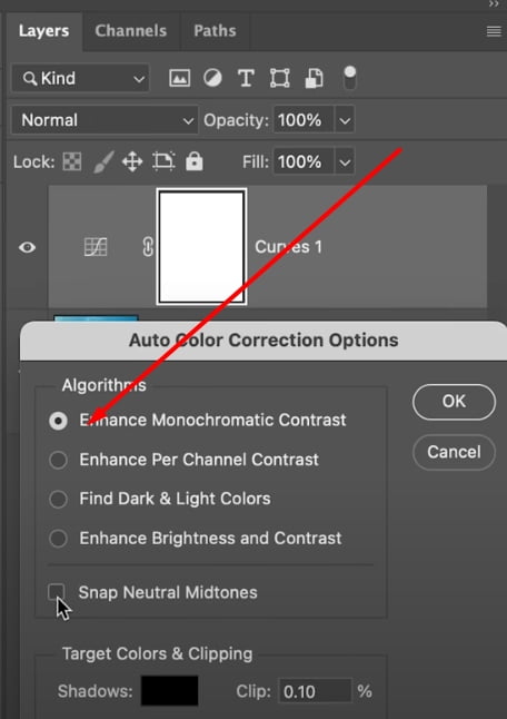
you don’t have to do anything right here click on the hamburger menu or the veg sandwich menu if you’re a vegetarian inside of that go to auto options now pick any of the first three this will give you access to snap neutral midtones let’s select the first check snap neutral

let’s select the first check snap neutral midtones and as soon as you do that have a look this is fixed or is it no
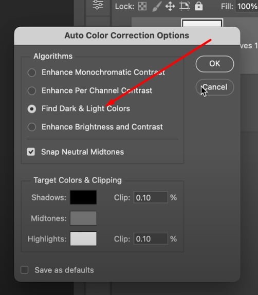
let’s try the second one and there you go it is fixed try the third one and pick any one that you like I think I’m going to go with the third one hit okay and this looks fantastic now you can do further arrangements if you want just double click on the symbol of the adjustment layer if you don’t see the properties and then let us just increase the contrast quite a bit like so there you go looks fantastic now if you do want to add some warmth in the highlights let us add my favorite color lookup table by clicking on the adjustment icon and choosing color lookup very easy way of adding warmth and just choose crisp warmth from right here adds wonderful warmth but we only wanted it in the highlights so how do we limit that you know it blend if so double click on the right hand side of this layer this opens up the layer style dialog box inside of that just take this effect away from the dark areas from the dark areas of what from the dark areas of the underlying
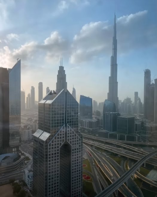
layers or the layers that lie under it so we’re going to play with the the sliders of what the underlying lay so let’s take the left slider from the left to the right like that it takes it away from the dark areas now it might be harsh in some cases so hold the ALT key or the option key click on the slider to break it apart and just make the transition smoother like so there you go it works wonderful warmth and here’s the overall before and here is the after that’s how to make the tint go away.
Two-Step Spotlight in Photoshop
Now in here we want to bring more attention towards the subject the attention goes more towards the brighter areas of the image so we need to make this brighter or the rest of the areas darker so let’s create a spotlight
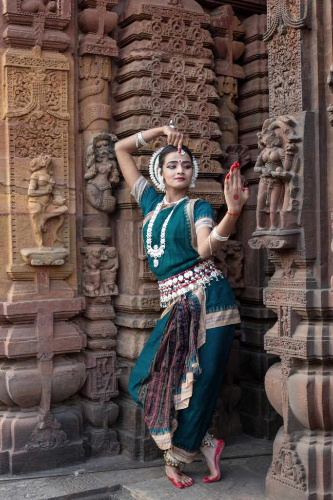
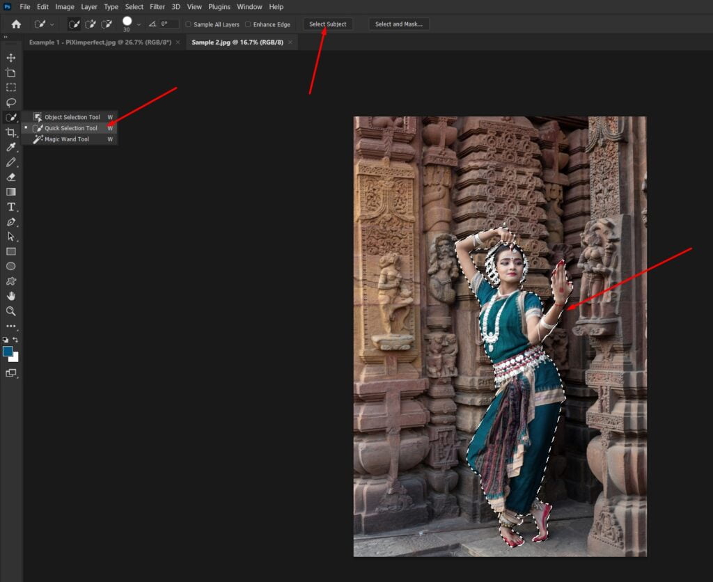
effect by simply clicking on the adjustment layer icon and choose curves and then just create a point in the middle and take it down like so wonderful Darkness around so we want to leave her out of this darkness before we create a spotlight this is a toight effect here’s how to do it let’s come back to the subject lay to have a better selection and then pick any of these three tools right here the object selection quick selection or the magic wand and at the top you’ll see select subject let’s click on select subject
now that we have a selection we need to come back to the mask of the curves adjustment layer and then just fill this with black with the foreground color black you can press alt backspace or option delete there you go we have left her out of that Darkness press controll or command D to deselect now you could have also created a selection and then created a curves adjustment layer but I like to work like an artist so here’s the before here’s the after already the attention is going towards her but we do need to create a spotlight behind her otherwise it starts to look fake with the curves adjustment layer selected press controller command G why are we putting this into a group so that we can have two masks for the same layer so with the group selected let’s click on the mask button right here now inside of this mask we’re going to create our Spotlight select the gradient tool right here pick a gradient from black to white and now you want to make sure you have your radial gradient selected not the linear one the radial one and just click and drag like so wonderful wonderful Spotlight isn’t it now you can stretch it you can squish it that is up to you so I’m going to keep it this way there you go so this is two levels of light so let’s make it this much keep it right here you can make it even thinner or larger that’s up to you now this seems to be about right now have a look so this is our first Spotlight first level of light and this is our second level of light thus creating a wonderful Spotlight effect and here’s the overall before and here is the after fantastic isn’t it now if you do want the spotlight at the back to be not that bright here’s what you can can do select the mask of the group and then open up the properties right here if you don’t see the properties go to window and you want to make sure properties is checked and then just simply decrease the density right here the density is like opacity for the mask so if you decrease the density all the way to zero it’s like there was nothing in there but if you increase the density it’s all of it
so you can reduce it accordingly 64 is nice that’s wonderful so here’s the before and here is the after she’s getting the spotlight she deserves.
Make Colors Pop
Now sometimes our images do need a little bit of color boost but we have to do it naturally we have to enhance the colors in a way that it’s not the glaringly leaking colors so if you were to create a hue saturation adjustment lay by clicking on the adjustment lay icon and choosing Hue saturation let’s make sure it’s outside of the group at the top and now let’s just increase the saturation like that at this point it’s completely leaking colors some areas are being oversaturated and it’s just not looking right you want to increase the saturation proportionately with less saturated areas having less increase in color and more saturated areas having more increase in color and how can we control that with the help of a saturation mask let us delete this hu saturation adjustment L by clicking or pressing the delete button now we need to create a stamp visible layer at the top here’s how we do it press control alt shift and E with the topmost layer selected this creates a merged layer of everything you see in the canvas right now if for some reason you’re not able to create it create an empty layer at the top and then press control alt shift and E that should do the job now let’s go to filter other HSB hsl Now set the settings this way you can also choose this one or this one that is up to you see which one gives you a better result hit okay and there you go done looks fantastic doesn’t it well of course not so let’s go to our channels and this is just a representation when you go to channel with this image the red represents the Hue green represents the saturation and blue the brightness or the lightness depending upon the setting that you chose so if you select the green Channel notice the representation right here the brighter an area is the more saturated that area is the darker an area is the less colors or less saturated that area is for example have a look at the floor it has less color but have a look at her clothes it has more color right here so if you were to go back to our R GB and turn this off you will notice the same thing this has more color than this flow right here and we can use that to our advantage let’s turn this back on go back to channels if you don’t see channels go to window and you want to make sure channels is checked since we want to create a mask based on saturation and green represents saturation hold the controller command and click on the thumbnail of the green Channel this will create a selection based on that once you have a selection you can come back to RGB you can can just delete this it doesn’t even matter now make sure by the way the group is closed so that whenever you create a new laay it’s always on top of that now let’s click on the adjustment layer icon and choose Hue saturation it will be created with that mask now let’s go to the properties of hue saturation and now if you increase the saturation have a look look at the enhancement of the color it’s so darn natural so I’m going to keep it at about 56 looks fantastic IC let’s have a look at the before and after so here’s the before and here is the after after the color you can even go further if you wish to like so and if there was no mask have a look everything would be glaringly too much and even when the floor didn’t have much color it just introduces too much blue in there so let’s turn on the mask by holding the shift key and clicking on the mask you can use the same shortcut to turn that off and now I think for me 56 or even higher maybe we can go 62 is nice want to have a look at the overall before and after so here is the before and here is the after isn’t she looking magazine worthy from straight out of the camera to magazine worthy.
Adaptive Presets
Now this is one of those incredible features that is right in front of us and yet many of us are just sleeping on it completely ignoring it and we shouldn’t be have a look at this so with the background layer selected press controll or command J now before we apply any filter go to filter convert for smart filters why so so that we can change the values later now let’s go to filter camera raw filter now we know the general camera raw and how to apply that but what we are talking about right here is something adaptive so let’s go to the presets section zoom in let me show you this scroll down and have a look at these adaptive presets this should be built in into the latest versions of Photoshop and Camera raw so if you open one of those adaptive presets like adaptive subject inside of that if you choose pop it automatically detects the subject and adds pop to it how wonderful so here’s the preview before after have a look at that warm pop you have soft something effect glow if you wanted to add that so let’s just add a pop now here’s a great part you can control the amount of it you can apply less of it or more of it that is just insane so I’m going to go with one2 and just with that here’s the before here’s the after and it doesn’t end there let’s zoom in on the face there’s so much more you can do so in the Adaptive portrait section you can enhance the entire portrait here’s the softened look you have glamour polished gritty look I really like that let’s go with the gritty one but not that much maybe just a little bit on top of that have a look enhance eyes just click on it eyes are enhanced and here’s before after you can have more of it less of it that is up to you you can whiten teeth with just one click before after so click on it it’s whitened you can darken the eyebrows or if there’s a beard there is no beard but click on darken eyebrows the eyebrows are darkened a little bit more and you can have more of it or less of it up to you I want a little bit more textured hair so you can scroll down and have a look at the hair section texture hair smooth hair texture hair smooth hair you can go with whatever you like let’s go with texture hair but not that much just just a little hair right there and it just goes on and on and on and on there is enhanced clothes you can do that as well let’s enhance it even more there are so many adaptive ones now this in the background sometimes Camaro detects that as a sky because there are clouds in it although artificial let’s open adaptive sky and have a look blue drama dark drama it’s just insane um maybe storm clouds crazy so let’s go with I don’t no it is so hard to choose let’s go with blue drama and you can have more of it or less of it so I’m going to have it at about 106 fantastic and on top of that you can just click and try dozens and dozens actually hundreds of builtin presets right there so maybe I’m going to open up deep skin by the way there are presets that are labeled deep skin medium skin light skin it doesn’t matter sometimes deep skin works great with lighter skin and sometimes lighter skin works great with deep skin so it doesn’t really matter much so in the Deep skin section this orange one is something that I’m liking let’s click on it and apply a little bit of it not that much just a touch 32 is fine and you can stop right here there
is so much that you can do and if you want a little more attention towards the subject remember we talked about attention going towards the brighter parts let’s create a vignette you can even scroll down and add a preset for it scroll down and in here you have presets for green sharpening vignette so a light vignette or a medium vignette you can add it accordingly let’s add light hit okay and just with that have a look at the before and after so here’s the before and here is the after with just a few clicks now it might be a bit heavy-handed so you can always decrease the opacity so I’m going to go with probably you know 65 66 I don’t like staying at 65 66 is the number to be
Subscribe for Newsletter

